Monday, 12 March 2012

Greg Horn

Most famous for his cover art for marvel comic books


Greg Horn is best known for his artwork on MARVEL COMIC’s titles ELEKTRA, EMMA FROST, and SHE-HULK. He is currently the regular cover artist on Ms Marvel. In 2008, he will provide cover art for VIRGIN COMICS' SHADOW HUNTER starring JENNA JAMESON, and TOP COW PRODUCTIONS' WITCHBLADE. Greg’s acclaimed work in comic books has opened up fantastic opportunities in many different art industries outside of comics. He has worked on high profile projects in advertising, video games, magazine covers, editorial, board games, and novels. Greg Horn's online art galleries cover every genre from comic book art, to sports, fantasy, science fiction, and horror.


Greg Horns personal website

Greg's personal website just shows the level of skill he puts in to his art work and his love for drawing female characters as you can see his homepage is a huge digital painting of a female Amazon style character with all the icons and links jotted around her not blocking any of her assets in a true comic book way


A famous piece from Greg Horn of the Avengers this painting is brilliant in showing the super hero status of them all you can sense the power of them all with there oversized weapons, i think the drawn on rips in the photo are so show they are all single hero's in there own right but united to fight together to create the Avengers


here are some more great examples of Greg Horns work he is excellent and showing the movement of the characters in the second photo from the first character dodging the arrows to the arrows themselves shooting through the air towards the views eye

the first picture really shows the skills Greg has in digital painting when he isn't drawing characters for super heroes and villains he is painting landscapes and awesome statues this piece was used as a cover art for a Marvel comic book

Feng Zhu

Feng Zhu


Feng Zhu is a well-known concept artist who has done work for various Hollywood studios and game developers, including Electronic Arts, Blur Studio, Disney, Sierra, MTV, Universal, Industrial Light + Magic, and the Skywalker Ranch where he worked on Star Wars Episode III.

Besides his professional work, he has also been teaching at the Art Center College of Design in Pasadena and making Gnomon instructional DVDs.


Feng studied architecture at UC Berkeley and industrial design at the Art Center College of Design, Pasadena.


Here are two brilliant examples of Fengs concept are in which he uses to teach his school in Singapore the techniques used to build such an eye catching digital painting such as these is he builds up in layers of really basic silhouettes which are build up in stages usually using a line drawing as guild lines and deleted it later on in the process you can watch tutorials of Feng's work online on his personal website and on you tube here is an example of one of them here


Here is a few more examples of Zeng's work as it has to be seen 


Aion's Concept artists

Aion's concept art 

Aion concept art is digital, print, drawn, or model artwork created by the official artists for the developer(s) and publishers of the title. This artwork is copyright the original artists and the publisher/developer which weirdly i can not find the names of but aion was created in Japan and the amount of concept artists that worked on aion is huge


This is by far my favourite piece of concept art to have came out of the title Aion i love the uses of colours  because the drawn your attiontion away from what is going on around the huge volcano like tower by the uses of glowing lights and bright colours the colours seem to fade as they get further away from the tower giving a sense of some sort of force field surrounding it building power to this picture.

__________________________________________________________________________________


i think this piece is done by the same artist as the first image because he uses the same sort of brush strokes to show the light relaxing off different surfaces in these fantasy type landscapes they tend to use more then one light source to give the image a better glow and make it seem to be more magical and intriguing, the uses of green in this picture really gives it the nature feel but still sticking to its rocky textures


__________________________________________________________________________________


Art work of a monster from within the game i think this is done by someone else who maybe more of a character designer then a scenario,
  This character they have designed here is highly detailed and very thoughtful of keeping the design to a mystical theme making this half beast half horse minion really fit in well with the games settings.

The uses of colour is also impressive giving the beast a dull and dark feel to him to promote his evilness with a small type of colour to show the power he controls in his hand.

Research Ideas and Concepts

Activity 1 - Research Ideas and Concepts

Research and analyse the ideas and concepts of artists, designers and interactive practitioners in your blog for this unit. You should look at the work of artists and research how they find ideas and then turn them into final concepts

What you must submit

A range of blog entries exploring ideas and concepts of artists, designers and interactive practitioners
Assessment Criteria for this activity

P1. compare ideas and concepts in art and design work

Friday, 9 March 2012

Progressive Rhythm


This image is a very good example of the different variants of progressive rhythm. The image is not simply overlapped but also has a unique perspective of which the fence goes into the distance i think this is a really good exsample of progressive rhythm


This image shows the perspectives of progressive rhythm really well with the tickets going out in the distances in a simple manner


this is my favourite image manly because it is artistic and has an old feel to it but always has been captured in a progressive way showing the piano keys go from big to small even tho they are all the same size

Flowing Rhythm


This was the first that came to mind when i thought of Flowing rhythm which shows where the idea came from as simple as the flow of a river which shows the pattern used in flowing rhythm really well, as it hits the same rocks on the way down it create the same look which creates a bigger picture of flowing rhythm


This is a great example of flowing rhythm because you can really see the movement of the image which in turn is just the same lines moving from the bottom of the picture to the top but in a real flowing motion

This design is a very good example of Flowing rhythm, It is a very simple image of hair like waves but really shows you how cliche but effective the concept of using Flowing rhythm may add the emphasis of movement to the piece.

Regular Rhythm


I think this is the most commonly seen regular rhythm of them all you see this all the time when out and about and is the best example to show as it shows a simple design can give a bold statment


I dont like this regular rhythm mainly becuase the design hurts my eyes and its pretty boring but i used it to show how simple it can be from the same image being repeating over and over


Another very good example of simple, regular Rhythm, it shows how the rhythm may be used in photography as well as paintings etc and how it can transform the look of your garden with just repeating the fence panels

Basis Rhythm

Regular Rhythm
Regular Rhythm in art is constructed from a series of different designs which all continue a pattern of continues flow in the same direction which can been seen in this image


Flowing Rhythm
Flowing Rhythm in design is built up from various different flowing type strokes, it flows across the page and may be random and spontaneous.


Progressive Rhythm


Progressive Rhythm in design is built up an image which the progressively continues across/into the page which creates extra dimension of the design.

Tuesday, 10 January 2012

illustrator training

This ying-yang was produced in Illustrator. The ying-yang is a very good example of spacial awareness. It represents positive and negative space and shows that when placed in a certain way small detail may stand out dramatically.


Simple landscape excise i did in Illustrator to show using the pen tool can different colours can show distances in a picture by having a foreground midground and background


Here is a colour wheel i did in photoshop to show the primary colours and how when put together with other primary colours ( green blue and red ) can make new colours

Monday, 14 November 2011

Interactive Media

This is a picutre i took of my Xbox Live dashboard which is an interactive menu to get from talking to friends watching films, buying music and of course playing your games, one of the most used interactive media's amount the younger generation but also widely used by older ones too

Literal:
Xbox dashboard with skyrim in the cd drive

Abstract:
Many menu's to pick from to try to keep you interested to stay on the interface and becoming interested in other things for sell

Cultural:
relates to modern society and is used by many cultures

Im pretty sure this counts as interactive media as you must interact with the media on the screen to be able to exccess your account on a cash machine i think i just answered my own question.

Literal:
A picture of the interfaced used on todays cash points ( ATMs )

Abstract:
A small hole in the wall which a piece of plastic can help you obtain your digital money from anywhere

                                                      Cultural:
                                                      relates to modern society and is used by many cultures


The biggest interactive media craze since sliced bread.. even tho i don't really understand that saying im sure it fits i picked this because well as i have one i do think it deserves a place on my blog as a Key change to how interactive media is used today this phone can do everything.... but most of all empty your pocket !
Literal:
Photo of the front, back and side of a white iphone

Abstract:
Iphone stood along side its self is the only contender in this picture and has no rivals

Cultural:
The iphone has been a big trend setting in culture of
today by getting people easy uses of internet whenever
where ever at high speeds

Proof that the Wii fit can be sold to anyone ! i think this is also a key interactive media of today as everyone wants to be fit all of a sudden its the cool thing to do so here is the example why go running when you can do it on your wii..... smart the because all tho its just a game it makes you feel your doing something good for yourself

Literal:
an old granny stood on a wii fit board trying out Wii Fit

Abstract:
even the old farts can enjoy playing games

Cultural:
proving that any age can enjoy console games not just the younger generation

This is the website that got me in to interactive media the most in my childhood even since Flash games become real big new grounds had them all from big names to people in there bedroom making the you could play them all for free and i always enjoyed the design side to them more then the actual game
Literal:
Screenshot taken off the homepage of a interative media website
Abstract:
a resting place for creative people who enjoy playing and build interative games
Cultural:
i think this is very aimed at the modern culture where everyone has internet at there finger tips

Scientific Images or Optical illusions


I think this picture is very witty and the meaning is very to the point and ironic as it says use only what you need and is only taking up a small part of the billboard aka " using only what the sign needed"
 This isnt really a illusion but i think it does make you look twice to think which a massive part of the billboard is missing
Literal:
A billboard with a poser on it that only takes up about 20% of the actual space which is " only what they need"
Abstract:
a cheaper way to fill the space and get a point across at the same time
Cultural:
showing todays cultures, how much of everything we waste even when it comes to a big billboard like this one
this one also is very witty but really does get its message across by proving its point within the billboard, i think its a very smart picture as it really makes you read what little part you can see due to the light and once read makes you understand the meaning.
Literal:
smartly used billboard where only one of the four lights which reviles the only message on the board which states " use Electricity wisely "
Abstract:
Controdicing the first picture which only use what you need by wasting the whole billboard to just show a light message
Cultural:this message is aimed at the modern culture of today who uses way to much electricity then we all need too


Yet again a awesome example of opitcal illusions the picture looks like the man is pulling the corner away with his mouth this is adverting a toothpaste to make teeth stronger
Literal:
an illusion of the a man who is in the picture apon a billboard is pulling the side of the billboard away from its stand using his teeth
Abstract:
showing the pure strength of the tooth paste they are trying to sell as being super stong
Cultural:
Brokes the boundary's of the poster
When i first seen this image i did actuality think there was two vans in the back of a lorries trailer making the optical illusion clearly a really good one because it fooled me, i don't see what the meaning behind a FedEx carrying UPS vans is but I'm sure its something to do with FedEx saying they are better.

Literal: The picture is of a lorry with a illusion of UPS trucks to seem as if they were inside the trailer
Abstract: the way i see this picture is that Fedex is so big that it Carry's the smaller company UPS on its back
showing leadership
Cultural: i think the cultural side to this picture is of how much the mondern world using delivery services so much that even other companies will have to deliver the smaller ones
I think this one is also brilliant because its saying life's to short for the wrong job as if this machines have people working in them for you as you can see in the picture, this is obviously an illusion but also a very smart propaganda

Literal:A cash machine showing an image of a man doing all the workings behind the machine
Abstract:What a cash machine would be like if technology wasn't around and was still run by personal interaction
Cultural:i think the cultral side to this image is that we take machines for granted and that people are being replaced by technology

Media, Advertising and Propaganda


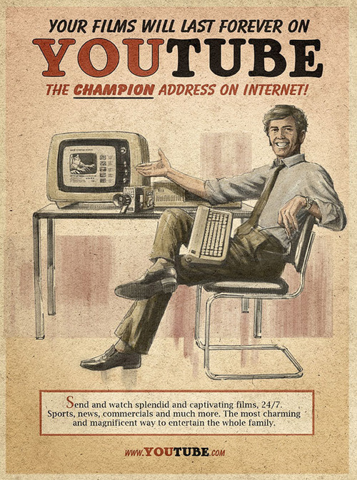
This advert is clearly for Youtube but in an old fashion style of posters kinda like the old propaganda pictures for the war i think this poser is trying to say youtube is last the times and might as well have been from back around the time the poser is trying to be.
Literal: an advert for Youtube
Abstract:showing that pretty much anyone can use youtube and enjoy its contains
Cultural: the poser is in the style of odd propaganda posters which were around in the war times 1940s but this image shows a man using youtube set in that time which is i think is to show that if the internet was widespread like it is today then this is the sort of posers you would have seen


in this advert the uses of cool colours is key to the product showing that you cant get a colder beer then cools light and the styling on the bottle subjects then too


Literal:Poster showing Cools Light beer
Abstract: showing that there beer is so cold that it can change anywhere in to ice caps and snow
Cultural: aimed at people who enjoy there beer ice cold promoting that there beer will be the coldest you were try

i think this is brilliant even tho i don't like star wars the way it looks like one of the old propaganda posers from the Germans and the fact that Darth Vader is symbolising the enemy aka the Germans asking for people to enlist in the war.

Literal: darth vader in an old style propaganda poster
Abstract:a poster trying to get people to join the darkside and fight the jedi which is done in an old army " needs you " style
Cultural: Some people believe that jedi is a real thing and this is aimed at them sort of people which has a strong messange that darth vader can't do it alone and needs YOUR help


I think this is really smart advertising making a zebra crossing in to the fries of a McDonald's pack of fries, the reason i think this is smart is because your bound to look at it as your pass it weather you want to or not you will which means you will look at the logo and think of McDonald's

Literal: Image painted on the floor of a busy town
Abstract: i think this shows how much people are controlled by fast food and the easiness of it that is has even become part of the world in the sence that they used an image of fries to make a zebra crossing
Cultural: Todays cultural is very much involed in fast food as everyone seems to always be busy and by this image being on a place most people will cross the road it will set the idea in there head that they maybe hungry and they will think of this image and head over to Mcdonlds for something to eat which im guessing isnt to far away from this image.

Examples of design


I thought of this design because most people will know it and is a pretty simple logo of a bat on a yellow back ground which is meant to show light and the black is a shadow
Literal: An image of the Batman logo
Abstract: very bold image of a bat on a yellow background which shows the light source to help the image stand out
Cultural: Popular Western cultural of the super hero world more recognised in the US

This example is someones design of a tattoo but clearly based around angel wings mixed with tribal the idea of them both together doesnt really go but this design has really shown that it is possible
Literal: A tattoo design in a tribal style
Abstract:i think this picture has a darkside to it even tho its of angel wings you can see a face in the middle with evil horns and i think the tribal style gives it a darkside
Cultural: The image is in a tribal design but isnt the normal type you would see which dates back a long time this has a modern twist to it
Here is design i did myself and is of an idea i had for my sisters tattoo which she does now have going down her right side ill upload a picture when i get it
Literal: A drawing of a tattoo i designed for my sister

Abstract: The abstract side to this image is to show new life can be held in a small thread and should be looked after

Cultural: I guess this is a modern cultural as i drew it myself and it was something to show new life
Coca Cola properly once of the most widely known logo and design which can be found all over the world which is simply a text font which goes to show not everything has to be detailed to become well known
Literal:Picture of the well known Coca Cola logo
Abstract:the image only needs to contain the products logo to make people think of it and most likey want it for themselfs
Cultural:this image is very well know in many countries and is a big name brand which can be found almost everywhere

Properly some of my most favourate designs but maybe not so much for the logos and text fonts but more for the product :) as the photo is taken in my room infront my xbox
beside that you can see with there designs that the black backround and bright colours are to grab your attention and inviting you over to see what this product is.
Literal:two cans sat next to an Xbox 360
Abstract: i think this shows the extent of what some people will go through to play xbox they will need extra enegry to continue playing games for long periods of time
Cultural: this is what the world has came to in resent years where people will spend more time infront
of a console then they go outside which makes products
like enegry drinks a lot more popular to assit them in there
obessions

Artworks

Taken from the internet this artwork is of an anime gilr angel i picked this because its one of my favourate types of art and goes to know that you dont have to be overly detailed to have a decent result

This is concept art for a game called Crysis 2 this little picture doesn't give it Justice the picture is so finely detailed that it almost feels like a real picture

Another famous Banksy picture which had to get in the Artwork section because all his artwork are creative and have such big stories behind them in this picture the balloon is to symbolist the little girls love as you can see its heart shaped and has you can see its far from her reach.
This is actually an in game photo from Skyrim which i think still falls under artwork even tho its a moving 3d world lots of people have put there time and effort in to designing it which in turn makes it a massive load of artwork in one picture

Again with the anime but this time taking its a little futher then the first picture because of the little bit more detail but the clearly 18+ feeling to it alot of anime is aimed more to adults then children making them cartoons for adults